Writing reviews of products is a hard thing. It is one of the hardest things about being a writer, contrary to popular opinion.
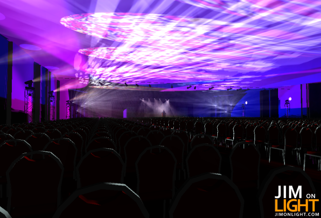
It’s no secret that I am a fan of the wysiwyg Lighting Design suite, I’ve been using it for years. Pretty much every show I’ve designed over the last five years has been done in a version of wysiwyg. I design them, print out the plot and paperwork, make pretty renderings for the client of what the show’s gonna look like down to the texture on the carpet on the camera riser if they want, and spend some time in virtual reality programming my palettes and positions to write the show totally offline.
I got to beta test R25 when it was being run through the paces. I designed a show in R25 beta that I executed this last week in Tampa – corporate show, medium sized rig in 3 ballrooms, maybe 2500 people. I was behind the Hog III driving my lighting spaceship to give the client a good show. Everything was programmed offline with updates on site, all through wysiwyg Perform Unlimited. Epic success prevailed. Looks are accurate, as are the photometrics. I’ll put my renders up against renders from Dialux, AutoCAD, or VectorWorks any day, any time. When I walk on site, I have confidence that the hard work I put into designing each show comes with me in that little purple dongle.
To first be critical – for my experience as a user, wysiwyg R25 solved my issues in the CAD department. The addition of a toolbar to deal with text solved a long time personal annoyance with the product. Such a simple addition, but so important. It’s a fine detail point – R25 has a lot of very fine detail hones, and some major implementation of other new features. One such feature is the ability to export fixture point-of-view images to the third party lighting control app we all love, Luminair for iPhone and iPod. On a side note, Ryan Hisey from Synthe FX (the Luminair people) is also working on the interface for the iPad. I can’t WAIT for that! I would buy an iPad JUST for that purpose – to take around with me on shows.
Let’s get into R25 a bit and look at the individual components – R25 has a lot of enhancements. In addition to not needing to render live shots (because the shaded view is so damned good that you can just screengrab), the enhancements and improvements in some of the basar functions of the suite make it faster to use. Why is this important? It’s important because if you’re a working designer with plots flying around the office like hotcakes, you need to be able to use your design suite with the speed of a ninja and still have the artistic stroke of Rembrandt. R25 made it happen.
CAD Mode – had lots of enhancements here, by no means an exhaustive list, I’m just capturing some of my faves:
- Font Styles – they’re all over the place now, I love it. Love it, love it, love it. Seriously, such a simple little addition and it made a huge difference in the way that you interact with the program. The text toolbar makes such an improvement over the interface. I wonder how many more times I can mention it, get the point?
- Positioning tools – send to back, bring to front, and tools for alignment. Big deals here – speeds up the interaction time within CAD.
- Visual Truss Assembly Indicators that show you how your truss is assembled (you know, “M”s and “W”s and all) with the foresight to know what’s happening before you add a bunch of lights and realize you screwed up the truss when you were putting it together. In addition, the right click menu options for truss assembly are much more robust.
- Cycle – for those of you who might not know what this is, it is an invaluable CAD tool. When you have objects stacked on top of one another in 2D space, you can click one time and “cycle” through all objects in that space without having to switch views and all of that other stuff.
- A quick Polygon tool for making exact polygons
Text and Alignment toolbars!
Truss positioning tools in action:
DESIGN Mode – more cool enhancements and features:
- Pan and Tilt Locking in the Focus Designer Tool – when you’re just building looks without a console in the Design mode, you can lock pan, tilt, or pan AND tilt to get those looks you want, easier.
- Library items all appear smooth, which is extremely great
- There are some new Camera features too that have been added – I tend to group these in with the Design and Live modes, since this is what I use most often to make client renderings. Camera views are now lockable, which is great, along with being able to save a new shaded view as a new camera. Hotkeys to switch between cameras is in place, which makes bouncing around during pre-viz a snap – and not like just a finger snap, like a real-time Blaine and Antoine from In Living Color “Around the World and Back” Snap. Yeah, that’s right.
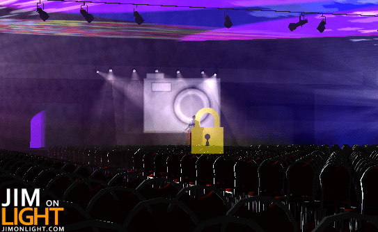
Camera lock – when you’re trying to move around a locked camera view, you get this to remind you it’s locked:
Turning a new shaded view into a new camera, lickity split:
Presentation Mode Features and Enhancements:
- Objects in Layouts can be locked into place
- Text Toolbar and Alignment Tools – WOOHOO!
- Modifiable corners on rounded rectangles in Presentation Mode
- We can now make perfect circles, 45 degree angles, and rectangles in Presentation Mode. Simple? Yes. Awesome? Yes.
- The New Plots feature has been optimized for speed and stability
- Worksheets are now SO MUCH EASIER to work with – column and row options, alignment options.
LED Walls and Video got a lot more awesome in R25 too – Gil Densham told me that people were calling R25 “video WYG” at ProLight+Sound in Germany this year!
- Video can now be displayed on LED Walls and split into sub sources! WTH! That is awesome.
- LED Walls now have a tab in their properties that allows modification of image/video sources and intensity
- LED Walls are now selectable in Design Mode, which is a huge time saver
- A generic video projector was added to the library
- LED Walls are up to four times brighter in shaded view
Here’s a quick video of R25 in action – pre-viz and design:
Another pretty great feature of R25 is the connectivity with Synthe FX’s Luminair 2.0 app for iPhone and iPod Touch. The wysiwyg/Luminair connectivity allows you to export fixture point-of-view images into the program. I have been getting some questions about this and why it is useful, and frankly the best explanation I can come up with is an example. Let’s say that your electricians are up in lifts trying to focus a large array of fixtures to specific shutter cuts, which can be a very difficult thing to call from the deck. Instead of trying to give them pieces of paper or focus charts, wysiwyg can export selected fixture points of view to iPhones or iPod Touch handhelds with Luminair installed, allowing your electricians to have an exact image of what their cuts and focus are supposed to be.
In my opinion, this is a revolutionary idea. wysiwyg and Luminair are essentially and potentially changing the way that we work, for both speed, accuracy, and general lack of confusion. I think that is pretty cool.
When I design, I use wysiwyg. In my head, lighting design is spatial, intangible, and ethereal in most cases. I use it to design scenery, too. If you’re using something else, at least try R25. I think your creative lighting muscles are begging for it.


Awesome review. Wyg just keeps getting better and better. It’s definitely been the major tool in my design process. Love it. Thanks, Jim!
i,m not speaking english but i live this one wysiwyg software. thanks
The wysiwyg software fucktion ,it,s very stronger.
Comments are closed.