Dan at Creative Stage Lighting just sent me an article about the first-person shooter Left 4 Dead, and how the team approached lighting and the overall artistic feel of the game’s graphics. It’s a good article, read it here on the Left 4 Dead Blog.
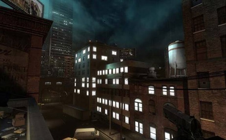
One specific example of the contrasts made in the article draws attention to an earlier version of the game, and how the initial lighting didn’t seem to fit the genre. The initial image, from an earlier version of the game:

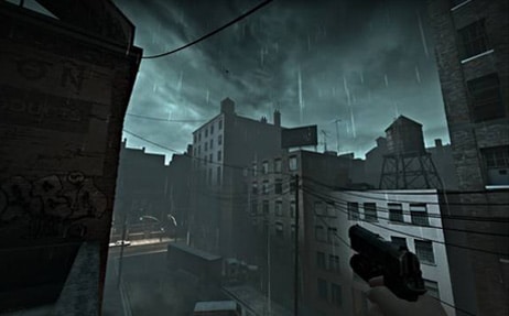
Contrasted to this image:

What I liked about this article was the process justification arguments behind the game, and how the first image is not representative of “horror” as a genre, and how the second image gave the player fewer places on which to concentrate. The player naturally wants to congregate in the lit areas, and the first image is too bright, too many places to draw your focus.
Check out the article, and thanks, Dan!


