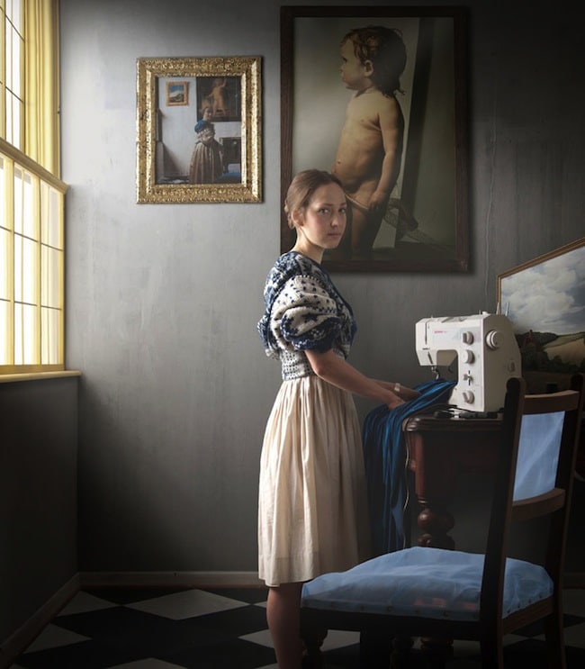
Back when I was in graduate school at the beginning of this decade, my mentor gave me this book called Baltic Light: Early Open-Air Painting in Denmark and North Germany after I designed lighting for a Thomas Dekker script called The Shoemaker’s Holiday. The book is very reminiscent of the Dutch master painters, like Vermeer, Rembrandt, Paulus Potter, Hals, and de Gelder. The Dutch master painters have always been so influential to me, even when I was a little boy. The way that these artists captured light in their painting is the stuff of miracles – I will always remember the skill of a painter named Ann Davis, who could take a piece of paper and a crayon and draw something that would make you cry. That’s how the Dutch golden age painters make me feel.
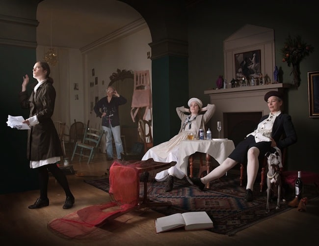
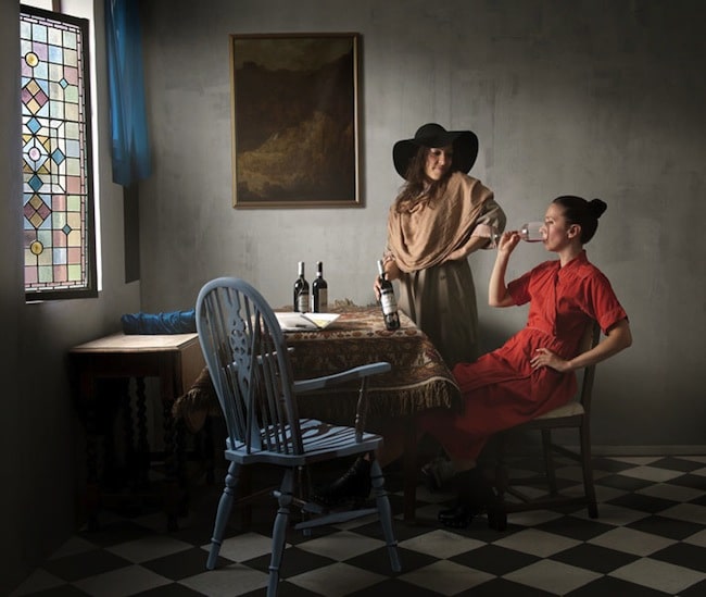
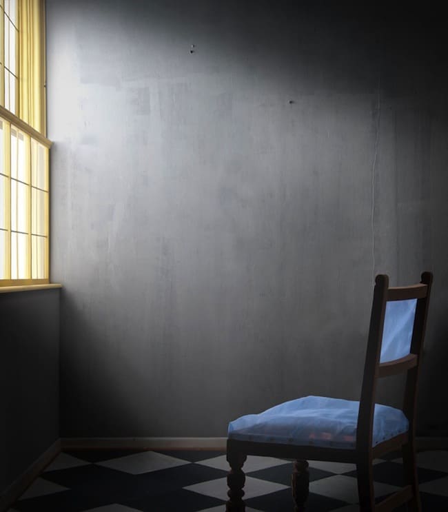
I just saw a series of paintings by artists Caroline and Maisie Broadhead that recreates a bunch of Dutch master-esque paintings that are just absolutely brilliant. Check it out:
Yatzer (which is a freaking awesome design blog, btw) caught up with the two artists and talked shop for a bit – check it out, interesting read!
Yatzer: What motivated you to draw inspiration from paintings by masters such as Vermeer, Velasquez and Magritte?
MB: We wanted to find a point at which our work could meet, in researching paintings that had an empty chair that we still enjoy the composition of, was what determined the chosen referenced images.
CB: The way in which we worked followed on from previous work completed by Maisie, where she had taken paintings that had jewellery as a strong narrative restaging and photographing them. I had worked on several chairs and wanted to explore this subject more after much discussion where these two ideas came together.
Yatzer: Which were the common and contradicting elements in your collaboration?
MB: This was the first collaboration it felt very natural, and worked well.
CB: I have worked collaboratively on a number of occasions. One element in this was where we were both keen on getting a balance of producing work that was both collaborative and individual works that retained the identity of each of us. We worked very well together, we talked a lot, and we questioned each other, negotiated and edited ideas that didn’t fit in with the common ground.
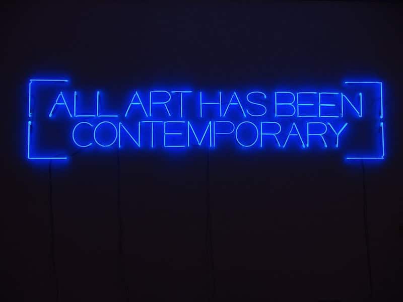
Yatzer: Merging the past and the present is a constant theme in the show. What is it that makes the show unique?
MB: The past as the present theme is something that came about as a reflection of our previous thoughts and concerns, my reworking the old masters and the old chairs.
CB: The past as a constant presence is nothing entirely new. It is a mix of something familiar and a difference from the familiarity that causes tension. It was useful for us to discuss how the situations in the paintings were relevant to our own lives and to the present day.
Yatzer: Is nostalgia one of the themes that inspired you for this show?
CB: I don’t think the show is a nostalgic one. I think it picks up on threads of experience from a previous age, and re-interprets them into a contemporary time. I don’t think that any of the pieces imply that the past is better than the present.
Yatzer: Using familiar and personal things like the wedding dress creates an intimate relationship with the viewer who witnesses the show. Was that something you had in mind?
CB: We were using personal icons, objects that are in our living spaces that mean something to us. They also act as substitutes and impersonations of the objects in the paintings. There was a certain flexibility in the way these objects related to the original painting and to the re-staging. Maisie was looking for ways of fulfilling a proximity to the original but also appropriating familiar things to make connections between periods of time / situations.
Yatzer: Why does the chair become the meeting point where your works confront one another?
CB: The chairs I chose to work with are all upright, wooden chairs that have been bought second hand, they are modest in their design and material. They are domestic items which wouldn’t be out of place in a modern home as such they are so ordinary. A chair denotes a person. The designs are controlled by the scale and proportion of a body, and most had evidence of use and contact with bodies. All this is interesting to me. In the paintings, all except for one was an empty chair. This gave a sense of expectancy of who might be approaching or who may have just left. I liked the idea of the invisible presence that the chair gave. The chairs had to work in the photographs, and in three dimensions.
Thanks, Yatzer! Awesome article.

