I love to think that at this moment in time in America, there could be tens of thousands of students learning how to characterize the controllable properties of light. No matter what industry of light a student goes into, the fundamental properties of light are the same. As lighting designers, we have so many things to know about light – and right when you think you have it figured out, light will do something completely unexpected and remind you that you don’t know everything!
So, what are some controllable properties of light in a design sense?
We can control the brightness of light, or the intensity, in many different ways – a dimmer, a douser, by using filters, louvers, you name it. Put your hand in front of the beam of light and see what happens – the brightness goes down. The sun is certainly less bright in the dawn than it is at noon – we know the property of intensity from a very young age. Our bedrooms as children were certainly less freaky during the day than they were at night. The reasoning behind why they were less scary during the day is a common theme between these first two properties of light – telling a story, or giving information. When it’s bright, we see more detail.
Here’s a comparative study of intensity, comparing 20%, 50%, and full beam brightness:

The intensity of light is perhaps the most important controllable property – without it we could not see, and what’s the point then, right? It affects every usage of light – every one. Sounds pretty simple, doesn’t it – well, it really is! I challenge you to find one use of light where intensity isn’t a factor.
The reference to the sun brings up another property of light that we all become familiar with very early in life, whether we realize it or not. The placement and spread of the light, or distribution, is a controllable property of light that gives the thing being illuminated its dimension. Distribution refers to direction and quality of the light. Keep in mind that when I say “light,” I am not referring to lighting fixture – I am referring to the light itself.
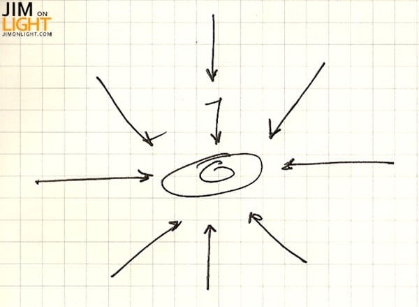
I’m sure if you’re studying lighting design (at least on a theatrical scale), you’ve seen this sketch:

Essentially this is a representation of a variety of ways you can light someone on the stage, conceived in plan view – straight on front light, angled front light (or McCandless style frontlight), top light (down light), straight back light or angled back light (key and fill), and side light. Now obviously these arrows do not represent the only directions acceptable for lighting something or someone on stage – quite the opposite, actually. My mentality as a designer is that there are very, very few places I can’t put a light. When it really comes down to it, you can affix a lighting fixture pretty much any place that is legally safe to do so. This is, of course, my mentality – I try to be true to the design when figuring out where to place lights and not to what is easiest and most convenient.
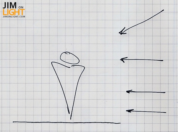
One thing you might have asked yourself with that first sketch is “what about the height of the light in relation to the thing being lit?” You have probably also seen this sketch:

Again – a very basic and rudimentary representation of some commonly used directions (in theatre and dance, for example) for side light on a subject or thing. The lowest arrow represents a close-to-the-floor, grazing the ankles of the dancers kind of direction. Lighting fixtures placed in this orientation are lovingly referred to as “shin busters,” derived from the incident of a dancer running full speed offstage and slamming their shins into the fixture. The second arrow up is the direction called “mid high” or just “mid” – aimed at the waist essentially. The next arrow is a “head high” or “head,” and is pointed at – you guessed it. The last arrow represents a “high side light,” which is a direction that can be pretty much at any angle. Combinations of these ideas can create wonderful dimension.
Besides giving sculptural detail and accentuation of the subject or thing being lit, the direction of the light also gives information and can help tell a story. When the sun is low in the sky, you obviously know that it’s either rising or setting (depending on how late you stayed at the tavern), and this is a glaring difference than the sun in its noon position. We can, with the direction of the light, reveal or hide architectural detail – brick facades for example, when lit well, can accentuate the brick texture to create a beautiful surface. If the direction isn’t appropriate, those bricks become a flat wall.
When considering direction, there are some relatively rare (comparatively, of course) directions that should not be overlooked. What about light coming from underneath something, from directly behind it? Like this:

Light from low and behind a subject can really speak volumes – the evil character in a drama, someone down on their luck, you name it. Light from underneath and you add depth in places that can be surprising and unexpected.
One of the properties of light in the distribution category is the light’s quality. This modifier pertains to the general “feel” of the light itself. Is the light soft-edged or soft focused? Is it crisp with a sharp edge around its pool? Does the light have texture? Is it diffuse? Is it “punchy” like an ACL PAR at a concert? One of my favorite qualifiers of light comes from my graduate mentor, Mary Tarantino at The Ohio State University – Mary always said that light can be “lumpy,” like the pool of an older Altman beam projector from back in the day. Those fixtures were great – the lumpiness that Mary spoke of came from the reflection of the lamp off of the reflector that would project on whatever surface the light was lighting.
Here are some visual examples of light qualities. Please note that these are obviously digital renderings from my visualization program, WYSIWYG:

This is not the be-all-end-all of qualities of light, mind you. These are some very broad generalizations to help the inexperienced gain a little insight.
No matter what field you’re in as far as lighting design goes – corporate, product, theatre, concert production, dance, opera, musical theatre, film, architectural, or industrial lighting – never stop experimenting with basic properties of light. You might discover something you have never seen before!


Punchy!
Comments are closed.