So I know it’s been a little while since WYSIWYG R23 has been released, but it’s never too late to show some of the pretty fantastic features that it’s packing. I have a ton of these for you (as there are a ton to show) so I’m breaking them up into smaller posts.
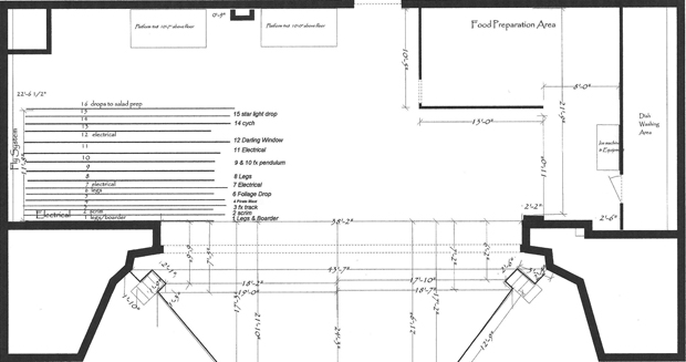
The feature that has significantly made life a bit more simple for me as of the last couple of days is the ability to import an image file as a “floor plan.” Once this image is in place and scaled (yeah, WYSIWYG scales it for you too), you can draw on top of the floor plan and use it as a map for creating a quick reference to either make a new drawing, copy on top of an old drawing, make some revisions to a drawing that your venue only has half a JPEG file for, or anything else you can come up with. It’s awesome. I am doing a show right now, as a matter of fact, that doesn’t have much information about their theatre, and they desperately need that information. The scenic designer and I have been emailing back and forth with files that are from a non-standard CAD program, and once I was able to find a converter for those files to JPEG or BMP, I was able to pop the theatre into WYSIWYG, quickly 3D-up the plan, and *POW* – I have a working model of the theatre so I can light it.
I am all giggles about this – I have so many old drawings that would brighten the day of many a TD or production manager if they just had a CAD of their eleventy thousand year old hand-drawn blueprint of their venue. Well thanks, Cast Lighting – DONE and DONE.
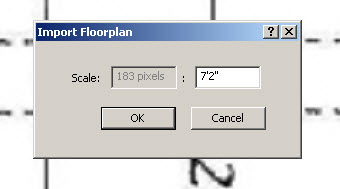
Adding the image file is cake – black forest cherry chocolate cake, mmm – and literally as easy as dropping the image in, measuring a line in the image, and telling WYG the length of that line. Done. I have to give thanks where thanks are due for this feature, because it saved me about two hours of trying to figure out an unscaled drawing.
A few pointers that I’ve noticed with this process:
- Your image needs to be no larger than 2048 x 2048 pixels.
- It’s best to crop to the outside edges of your walls before importing an image for the floorplan. I mean that extra white space in your drawing should be cropped out – when I dropped in a drawing that was about half of an E sized sheet, WYG wasn’t as happy with rescaling it as it was when I cropped the extra white space out.
- You need a bitmap (.BMP), jpeg (.JPG), gif (.GIF), png (.PNG), tiff (.TIFF), or targa (.TGA) image file to use the tool.
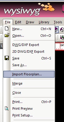
Okay, the first step is to click the FILE menu and choose to import floorplan:
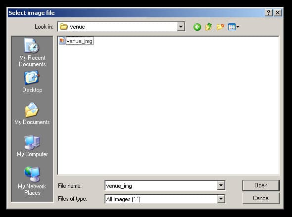
Once you click this option, you’re going to get a dialogue box asking you where that pesky image file of your floorplan lives – just a standard dialogue box. Navigate to your image file and choose it.
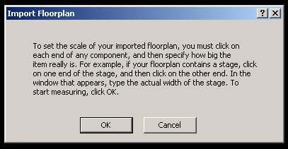
Once you’ve told WYSIWYG where that image file is hiding, it’s going to give you a brief description of what’s going to happen next.
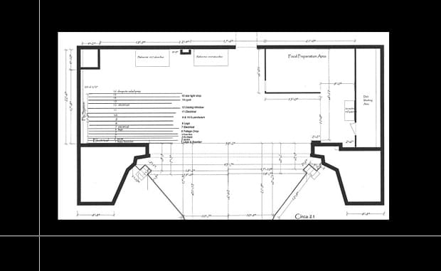
You’ll then see that image file. This is a good example of cutting that extra white space out of the outsides of the image – anywhere on the outside edge of my venue’s walls has to go. I left this one in here because… well, because I forgot to take it out and took mine out later, but I thought this would be a good time to show that image with the white space and without. Below is with the space:
This is the image file without:

Okay, back on track – once you drop the image in the drawing, you’ll need to zoom into the image and give WYSIWYG the gist of some lengths. If, for example, you have a stage that is 40′-0″ wide, then you’ll move your crosshairs to point A and click (one side of the proscenium) and then at point B and click again (other side of the proscenium). I had some hard measurements on my drawing, so I chose one.
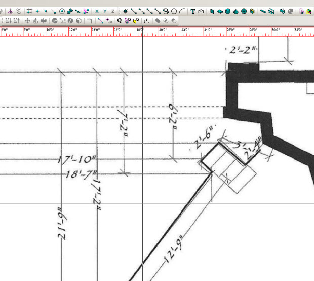
Once you’ve done the two clicks, WYSIWYG will say “hey drafter, how long’s that line, duder? (or dudette, you know). Enter in how long the distance is between your two clicks.
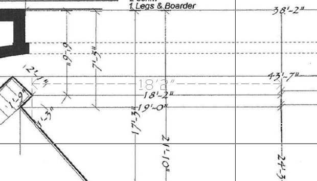
VOILA – WYSIWYG has scaled that floorplan to the correct scale – which in WYG is 1:1 of course – you scale your paper after you’re finished drawing. As you can see below, my 18′-2″ is 18′-2″!
I hope this has been helpful – I have tons more to post!


I’ve used this feature and it really is fantastic – saves lots of work!
I am also a big fan of the new rulers – so simple, so awesome!
I wish VectorWorks would steal that.
Ha!
Comments are closed.